Resources
Home
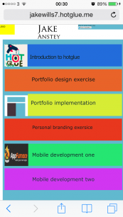
Hotglue
Implementation
Portfolio design
Development 2
Personal branding
Css Zen Garden
Portfolio design
The design process would be me creating the portfolio, looking a certain elements such as who the website was for, what it included and what it worked on. The design is always very important as this is where you need to aim to please your audience and make sure its easy for them to access and navigate.
Mobile development 1
Who is the Target audience?
Lectures who are marking my work, myself, friends who may want to view the work that I'm doing and maybe even future employers.
Which platforms would it be accessible on?
Windows pc, Apple mac, Mobile devices and tablets.
What is the main Idea of having the pages?
The main idea is to showcase my work in a tidy portfolio which viewers can look through when they need to. It gives people an opportunity to view my work in an easy way and they could view it anywhere with an internet connection.
What went well ?
I think that the way the content looked on mobile devices was really good, I know from when I created my previous pages in the first few weeks that this wasn't always going to be the case unless you thought about your design. When I created the test pages You had to scroll over loads to view all the content. I think the main reason behind this was that I was creating it on a large screen and wanted to make it full size on that, so when it went down to small sizes screens it just didn't adapt to the screen size. Creating This portfolio on a Macbook pro seemed to solve this issue somehow.
What didn't go so well?
I think that if I had planned better from the start then I could improved on how the site looked and manoeuvred the content in a different way, I also thought late on about having an about page to say a little bit about myself, but by the time this idea arose it was close to the hand in date.
Final thoughts and improvements
Overall I think that the design works well on the devices that I tested it on and this is an important thing when it comes to websites in current times, I also really like the navigation bar and its consistency throughout, this was one of the changes that I think was for the better. If I was to improve the site I would create an about me page and possibly and contact me page, I feel this could be useful for people viewing my work to let me know what they think about it or even just to ask more about my designs and processes.
Review process
The first things that had to be thought about were:
Who is the Portfolio for?
The portfolio was created for lecturers to view and mark, myself to have somewhere to embed my work which is viewable online and too anybody else who wants to look at my work whether its just friends or maybe even future employers.
What does the website work on?
The site has been created using a macbook pro which has a 13.3” screen so this is what its viewed best on, although having tested it on other devices such as an iPhone 5 and an iPad mini I can say it looks good on other devices, its all proportioned well and its still clear other than zooming in on smaller text.
What does the site include?
The site includes the work that i’ve done in the sub units and is mainly documentation, this includes photos, screenshots and writing explaining about what i’ve done.
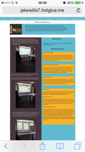
Once I had created some of the pages I thought it was a good idea to test them on other devices such as a my mobile phone and tablet, above i've included some screenshots on how the pages displayed on an Iphone 5.
I think that they display really well other than the small text needs to be zoomed on, but this is the case with many websites being displayed on mobile devices.
Below are some images of feedback given to me by my colleagues. Here is the design when the website was reviewed by others, When they made comments I made a list of things that needed to be looked at, this was helpful as I could listen to other peoples thoughts on my designs and although there may have been some criticism it was something I could listen to, to improve on my site.
Here is the list of changes that I made, some of the things were small such as changing the transparency of the colours on the homepage to make it easier on the eye and some were longer winded such as keeping all of the pages consistent throughout.
No resources used for this page.
Below is a rough design that I've thought about. If I was to start again I would probably create something in this layout, I feel that it takes up space and its well ordered. This would be consistent thoughout.
After testing on a larger screen I found that my site didn't scale to the size of the screen, this was tested on a 21.5 Imac, This would be something i'd have to consider if I had to create something similar.